If your website feels “busy”, it usually means you’ve done a lot of work: more pages, more sections, more features, more content, more buttons. On paper, that should equal more leads.
In reality, “busy” often translates to one thing for a visitor: confusing.
And when people feel even slightly confused, they do the most human thing imaginable… they leave. No enquiry. No call. No form submission. No booking.
This guide is built for Australian businesses that want leads, not just “activity”. You’ll learn why busy sites underperform, how to diagnose whether it’s a traffic issue or a conversion issue (or both), and what to fix first to turn visitors into enquiries.
What a “Busy” Website Really Means
A busy website isn’t just one with a lot of information. It’s a site where the visitor can’t quickly answer three basic questions:
• What do you do?
• Is it for me?
• What should I do next?
When those answers are hard to find, the user’s brain is forced to work too hard. Even if your service is brilliant, the website experience becomes the blocker.
Common signs your website feels busy
You may have a “busy but not converting” website if you recognise any of these:
• Your homepage has multiple CTAs competing (Call Now, Get a Quote, Download a Guide, Book a Call, Subscribe)
• Your hero section is full of buzzwords but light on specifics
• You have too many menu items (especially drop-downs within drop-downs)
• Your pages feel like a “brochure” rather than a guided path to an enquiry
• You keep adding sections to “cover everything”, but conversions don’t improve
• Your forms are long, clunky, or feel intrusive
• You’re getting traffic, but enquiries are flat (or the leads you get are low quality)
The Core Problem: Too Many Choices, Not Enough Clarity
Busy websites typically fail for one of these reasons (and often a combination):
• Choice overload: you’ve given people so many options they can’t pick one
• Message dilution: your value is buried under features, jargon, or competing offers
• No clear path: users can’t tell what step to take next, so they take none
Choice overload doesn’t look like “choices” to you
From your side, you’re trying to be helpful:
• “Let’s show everything we do”
• “Let’s include every industry we serve”
• “Let’s add the blog, the ebook, the checklist, the free quote, the phone number, the chat widget…”
From the visitor’s side, it can feel like walking into a store where everything is shouting at once. People don’t think, “Wow, so many options!” They think, “I’ll deal with this later.”
And “later” rarely happens.
A lead-focused website has one job per page
A page that generates leads is designed around a single primary outcome.
For most service businesses, that outcome is one of these:
• Enquiry form submission
• Phone call
• Booking a consult / discovery call
• Request a quote
Everything else on the page should support that outcome — not compete with it.
Is It an SEO Problem or a Conversion Problem?
Here’s the trap: many businesses assume “no leads” means “not enough traffic”.
Sometimes that’s true. Often it isn’t.
A quick way to frame it:
• SEO problem = you’re attracting the wrong people (or not enough right people)
• Conversion problem = the right people arrive, but the page doesn’t persuade them to act
• Both = you’re attracting mixed traffic and the site experience isn’t helping anyone decide
A practical diagnostic you can do today
Use this simple checklist. You don’t need fancy tools to start.
If you have:
• Low traffic to service pages → likely visibility/SEO distribution issue
• Good traffic, low enquiry rate → likely conversion issue
• High bounce on key pages → likely message mismatch or page experience issue
• Enquiries that aren’t qualified → likely intent mismatch (SEO targeting + offer clarity)
A healthy next step is to stop guessing and start separating:
• Traffic quality (who arrives and why)
• On-page clarity (what they see first)
• Friction (what makes action annoying)
• Proof (what makes action feel safe)
The 5-Part Fix Framework
Use this framework to simplify your site and lift leads without rebuilding everything from scratch:
• Message
• Path
• Proof
• Friction
• Match
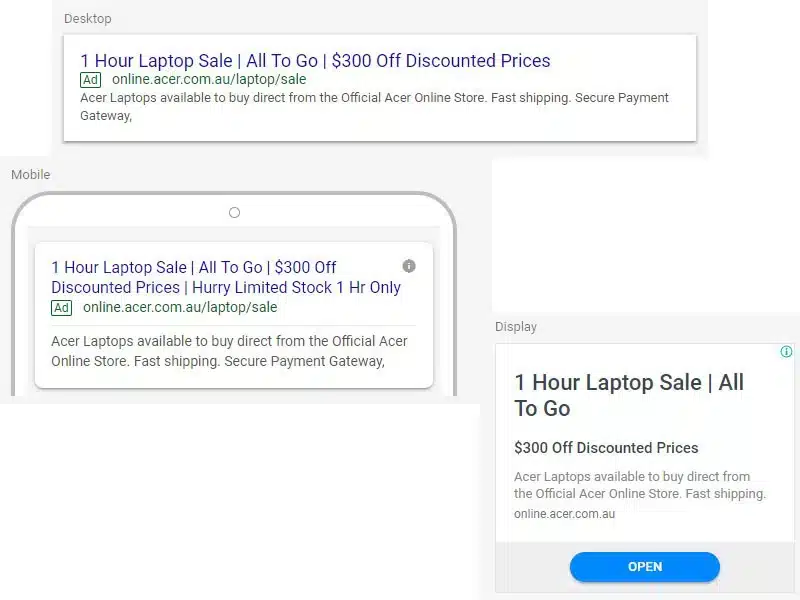
1) Message — Make the first 5 seconds do the heavy lifting
Your hero section (top of the page) is the “make or break” zone. If visitors can’t instantly understand what you do, they scroll in doubt — or exit.
Aim for:
• A specific headline (what you do + who it’s for)
• A short supporting line (outcome or differentiator)
• One primary CTA
Examples of clearer messaging (service business style):
• “SEO for Australian service businesses that need more qualified enquiries”
• “Web design that turns visits into quote requests, not just compliments”
• “Managed IT for SMEs who want fewer outages and faster support”
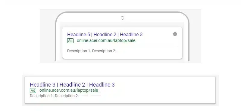
Busy website warning sign: multiple CTAs above the fold.
Pick one primary action and make everything else secondary.
2) Path — Give visitors one obvious next step
Your website should feel like a guided conversation, not a choose-your-own-adventure.
Fix your path by:
• Reducing your main navigation to essentials
• Grouping services under one logical “Services” area (not 12 top-level menu items)
• Making your primary CTA consistent site-wide
• Adding “next step” sections (for example, “What happens next” or “How it works”)
A simple rule:
• Every page should have a primary CTA
• Every major section should support the CTA
• Every page should reduce uncertainty
If you’re already investing in search visibility and want the traffic you earn to convert, consider building the conversion path alongside your organic strategy through professional SEO services in Australia.
3) Proof — Make the decision feel safe
Visitors aren’t just buying your service. They’re buying the feeling that choosing you won’t backfire.
Busy sites often have “proof”, but it’s scattered or vague. You want proof that’s easy to scan and easy to believe.
High-impact proof elements:
• Short testimonials tied to outcomes (not “great service!”)
• Case studies with a clear before/after
• Review snippets (especially if you service Australia-wide)
• Team photos (real people beats stock every time)
• “As seen in” logos only if legitimate
• A short “why us” section that’s specific
Where proof should live:
• Near the top (to reduce scepticism early)
• Mid-page (to sustain interest)
• Near the CTA (to reduce last-minute doubt)
4) Friction — Remove anything that makes action annoying
Friction is anything that makes it harder to enquire.
Common friction points on busy websites:
• Forms that ask for too much too early
• Unclear pricing expectations (even a “starting from” helps)
• No indication of response time
• Pages that load slowly on mobile
• CTAs that change wording across pages (“Get Started”, “Submit”, “Contact”, “Enquire Now”)
Quick friction fixes (high ROI):
• Shorten your form to the minimum (name, email/phone, message)
• Add a “what happens next” line under the form
• Reassure privacy and handling of details (especially for lead forms)
If you collect personal information through enquiry forms, it’s smart to align your wording and policy with an Australian Government authority. A practical reference point is the Office of the Australian Information Commissioner’s guide to the Australian Privacy Principles (government link), which helps users feel confident submitting their details.
5) Match — Align intent, page promise, and CTA
This is where busy websites quietly lose leads.
If someone searches “emergency electrician” and lands on a generic homepage with 20 services, 14 locations, and a vague headline, that’s a mismatch. They wanted a fast answer and a clear next step.
Intent match means:
• The page headline reflects what they searched for
• The first section confirms you’re relevant
• The CTA matches the urgency and decision stage
For Australia-wide businesses, this often means:
• Creating “service + audience” pages (not just “Services”)
• Building “problem + solution” content clusters
• Guiding people from information pages into a clear enquiry path
If your current traffic is solid but conversions are lagging, it’s usually because your SEO and your on-page experience aren’t working together. That’s where it helps to learn more about SEO that drives leads rather than chasing rankings alone.
What to Fix First
When a website feels busy, it’s tempting to redesign everything. Don’t.
Start with the highest-leverage areas that directly influence enquiries.
The “90-minute triage” priority order
Priority 1: Above-the-fold clarity
• Rewrite the headline to be specific
• Reduce to one primary CTA
• Add one proof element near the top (for example, a review snippet)
Priority 2: Service page CTA consistency
• Use the same CTA style and wording across key pages
• Add CTA blocks mid-page and near the end
Priority 3: Form friction
• Remove non-essential fields
• Add a response-time expectation (for example, “We’ll reply within 1 business day”)
Priority 4: Trust placement
• Add proof near the CTA, not only on a testimonial page nobody visits
Priority 5: Navigation simplification
• Reduce menu items
• Keep the user focused on the primary journey
These steps alone can lift enquiries without touching your logo, colours, or full layout.
A High-Converting Service Page Blueprint
If your website is your lead engine, your service pages are the pistons. Here’s a proven structure for service businesses that want more enquiries.
Section-by-section blueprint
1) Hero (above the fold)
• Who it’s for + what you do
• Outcome-focused subheading
• One primary CTA
• One proof element (review, badge, number, or client logo)
2) Problem + empathy
• Show you understand the pain (time, cost, risk, confusion)
• Keep it short and specific
3) Your solution (how it works)
• 3–5 steps in plain English
• Emphasise what the client experiences, not just what you do
4) Proof + results
• Case study snapshot or outcome-focused testimonials
• If you serve Australia-wide, specify industries, niches, or service areas clearly
5) What’s included
• Bullets work best here
• Avoid a wall of text
6) FAQs
• Answer the objections people think but don’t ask
• Include practical details (timelines, process, who it’s for, what you need from them)
7) CTA (with reassurance)
• One CTA
• “What happens next”
• Privacy reassurance
• Alternative option (call/email) if relevant
If you’d like your pages to follow this structure while also earning consistent organic visibility, a combined approach through comprehensive SEO support for Australia-wide businesses tends to outperform “SEO only” or “design only” efforts.
The “Busy Website” Traps That Quietly Kill Leads
Busy websites don’t always look “bad”. Many look polished — which is why the problem is easy to miss. Here are the most common traps that feel productive but reduce conversions.
Too many competing offers
If you’ve got five “primary” offers on one page, the visitor has to decide:
• What should I click first?
• What’s most important?
• What’s the right option for me?
If the page doesn’t answer those quickly, the safest decision is to make no decision.
Fix it:
• Choose one primary outcome per page
• Make any other options clearly secondary (lower in the page, smaller buttons, less emphasis)
Jargon-heavy copy
Buzzwords might sound impressive, but they slow people down. “Synergistic solutions” doesn’t help a visitor understand what happens after they enquire.
Fix it:
• Replace jargon with outcomes
• Use plain-language headings that match how people search
• Keep your first paragraph short and concrete
Weak or generic CTAs
A CTA like “Submit” tells people nothing. A CTA like “Get a free quote” can be strong — but only if the page supports it with proof and clarity.
Fix it:
• Make your CTA outcome-based (quote, call, consult, audit)
• Repeat the same CTA wording consistently
• Add a reassurance line directly under the CTA
Measurement That Tells You What’s Actually Broken
Busy websites often create “data noise”. You’ll see lots of activity, but the signals are unclear.
Here are the metrics that matter for lead generation.
The few numbers worth watching
• Conversion rate (per key page): enquiries ÷ page sessions
• CTA click rate: how often visitors click your main CTA
• Form starts vs form submits: where people drop off
• Scroll depth (service pages): are users reaching proof and CTAs?
• Device split: mobile behaviour often exposes friction fast
Quick interpretation guide
• Strong traffic + low conversion = page clarity, trust, friction, match
• Low traffic + strong conversion = SEO/content distribution opportunity
• Low traffic + low conversion = start with message + intent + SEO foundations
AEO-Friendly Questions and Answers
Why does my website get traffic but no leads?
Usually because the page isn’t giving visitors a clear, confident next step. It can also mean the traffic intent doesn’t match the offer (wrong keywords or generic landing pages).
What makes a website feel “busy”?
Too many CTAs, too much competing information, unclear hierarchy, and a lack of a guided path. Visitors can’t quickly understand what to do, so they do nothing.
What should I fix first to increase enquiries?
Start above the fold: clarify the headline, reduce to one primary CTA, and add proof near the top. Then simplify your form and place trust signals near the CTA.
Is this a web design issue or an SEO issue?
It can be either, but often it’s both. SEO gets the right people to the page; conversion-focused UX and messaging helps them take action.
How many CTAs should a page have?
One primary CTA per page, repeated in multiple places. Secondary actions (like “read more” or “download”) should not compete with the main enquiry action.
What This Looks Like in Real Life
If your website feels busy, your goal isn’t “make it minimalist”. Your goal is make it decisive.
A decisive website:
• Tells users instantly what you do
• Guides them to one next step
• Proves you’re credible
• Reduces friction to enquire
• Matches the page promise to the visitor’s intent
When those five pieces work together, you’ll often see leads improve even if traffic stays the same — because you’re finally converting the attention you already earned.
Next Steps for Nifty Marketing Australia
If you suspect your website feels busy because it’s trying to do too much, the fix is rarely “more content” or “more buttons”. It’s almost always:
• Sharper messaging
• Clearer paths
• Stronger proof
• Lower friction
• Better intent matching
That’s exactly where a combined SEO + conversion approach pays off — so you’re not just increasing visibility, you’re increasing enquiries.